
Aiming to make health/wellness fun and personalized, just for you.

Mobile. Tablet
Landing Page, Web App, Branding, Personas, Wireframes, Flowcharts, User interface, prototyping.
Project Overview
The goal of the project was to help millennials develop the basic building blocks of cooking and fitness. Research shows that a growing amount of young adults aged approximately 16-28 lack the confidence and skills to cook for themselves. This is leading to health, monetary and social issues. Fit4Life allows users to improve skills and eating habits by providing healthy recipes and to implement healthy exercise routines.
My Contributions
I was the only designer working on this project. I conducted the user research and created everything from the brand, mockups, wireframes all the way to the final ui designs.
College students find it challenging to adhere to a healthy lifestyle
I have gathered that many students have difficulty adhering to their academic life while being consistent with their health goals.
Problem
Having access to easily accessible resources is key to a healthy lifestyle
The Solution
Accessible resources
At the start of this project, I began with defining the brand and understanding the target audience.

Starting with basics- Who, What and Why

Fit4Life provides a platform to cook healthy foods within your community. Users are able to share recipes with friends as well as customize their recipes to their liking for the next cooking session.
In order to show how the platform would be organized I created a flowchart. I combined my ideas along with the users to create useful solutions to their needs.
Feature of App
Defining the flow
After I defined the flow I proceeded with creating the wireframes to explore the experience in more detail on a screen-by screen level. The main focus was the food suggestions which sits at the heart of the app.
Wireframing
Next I moved onto exploring the overall visuals of the app. I did this by creating 3 landing page mock-ups using the same layout but different styles. Taking this route instead of creating mood boards helped communicate different directions we can take more vividly as the client could clearly see the impact each direction would have.


Visual Exploration
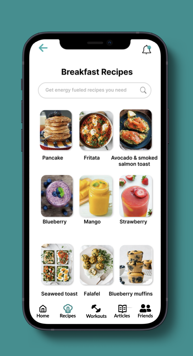

Final UI
Conclusion + Lesson Learned

What i’d do differently next time,
Iterate as much as I can. In the beginning stages, I’ve explored so many different options to try finding the right solution for my student users- I’ve ended up “restarting” my project over 3 times with over 9 iterations of my FIGMA file to make sure every aspect of the app was designed with intention. Not to mention- I have a better sense to obey WCAG standards next time!
Focus more on tradeoffs with each direction I hope to become stronger in communicating these tradeoffs with the user in mind so I can better communicate my design decisions to myself, my mentor, and future recruiters.
Be insight- not process-driven. Despite weeks of research + development, my first version of this case study was full of unnecessary text at this stage instead of tying everything into the bigger question- “so how does this fit into the bigger picture”? Hence, I cut down the copy by more than 60% and focused on the major points in my project. Hence, going forward I believe focusing more on the insights will improve my storytelling abilities to others.
You didn’t fail- you just found 100 ways that didn’t work. From noticing mistakes in my UI to uncovering more foundational UX problems in my app, I’m thankful to have constantly asked for feedback from my peers and my mentor. In the end, I pushed to have the app as best I could, and did not let my own thinking stop me from questioning if my own decisions were truly best for the user.